Why Mobile-Friendly Website Design Matters in 2026
Learn how mobile-friendly website design improves trust, enquiries, accessibility, performance and search visibility—and how to test it properly.
Article guide On this page
A mobile-friendly website makes important information and actions easy to use on a phone, not merely visible on a smaller screen. Customers often discover a business, compare options, check directions and make first contact from the same device. If that journey is slow or awkward, they can leave before the business has a chance to explain its value.
Mobile design therefore affects customer trust, enquiries, accessibility, performance and search visibility. It should be planned from the beginning rather than treated as a final technical check.

What does mobile-friendly website design mean?
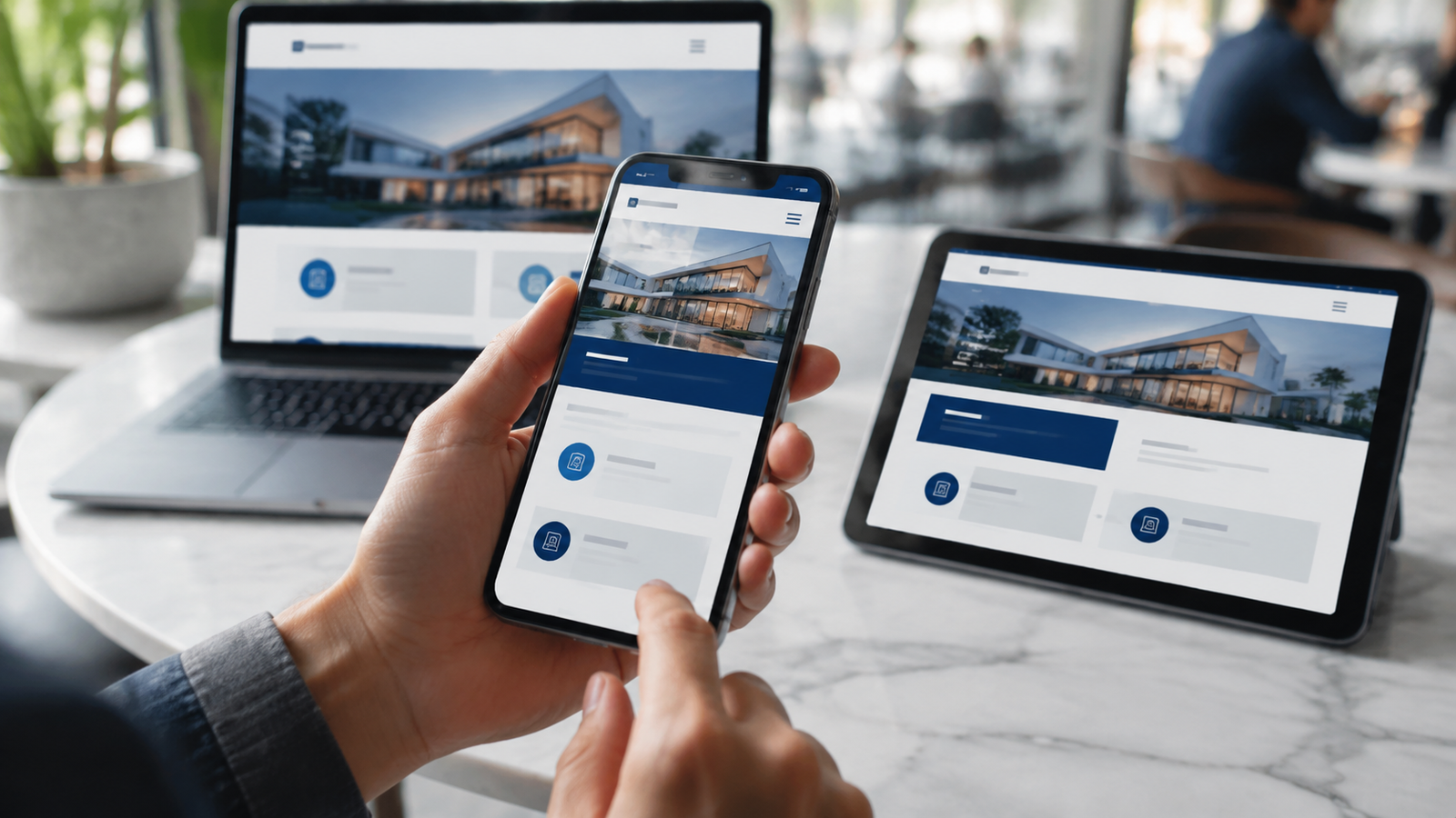
A mobile-friendly site adapts its layout, content and controls to different screen sizes and input methods. Text remains readable, navigation is understandable, buttons are comfortable to tap and forms work with mobile keyboards. Images and scripts are delivered efficiently enough for real mobile connections.
Responsive code is part of the answer, but good mobile design also changes priority. The most useful information and action should appear before lower-priority decoration.
Why mobile design matters for small businesses
It protects the first impression
A visitor may decide whether the business feels credible within seconds. Overlapping content, tiny text or a confusing menu makes the organisation look neglected even when its actual service is excellent. A clear mobile experience supports the wider trust signals covered in our guide to looking professional online.
It removes friction from enquiries
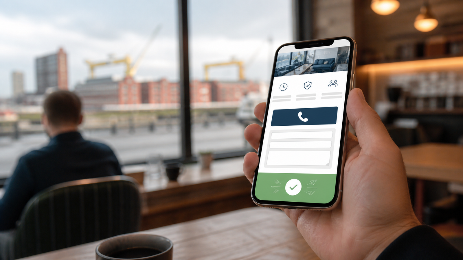
Mobile visitors may be travelling, comparing businesses or trying to complete a task quickly. Keep telephone numbers tappable, directions easy to open and contact forms short. A user should not need to zoom, copy a phone number manually or hunt through the footer.
Our guide to booking and contact forms explains how the form itself connects to lead generation and follow-up.
It supports search visibility
Search engines need to crawl and understand the same useful content customers receive. Important text and links should remain present on mobile, headings should retain a logical structure and pages should load reliably. Mobile design and technical SEO work together rather than competing.
For a wider technical review, see our SEO and Google visibility service.
It improves accessibility
Readable typography, clear labels, keyboard support, visible focus and adequate contrast help people with disabilities and also improve general usability. Do not rely only on colour, gestures or placeholder text to communicate essential information.
Mobile-first design principles
Prioritise the customer’s next action
Decide what the visitor is most likely to need: understand a service, call, book, request a quote, check a location or view proof. Give the primary action visual priority without covering content with intrusive banners.
Use a simple navigation structure
Keep menu labels short and descriptive. Avoid deeply nested menus when a clear landing page can organise the options. Make the logo return to the homepage and ensure the menu can be closed without precision tapping.
Design content for scanning
Use meaningful headings, short paragraphs and lists where they genuinely improve comprehension. Put essential information before long background sections. Mobile copy should remain complete; it should not be a thin version of the desktop page.
Make controls easy to operate
Provide sufficient size and space around links, buttons, checkboxes and form controls. Do not place competing actions so close together that a user can easily select the wrong one. Use visible text labels rather than unexplained icons.
Choose responsive media
Deliver appropriately sized images, reserve their layout space and avoid autoplay media that consumes data or distracts from the task. Important information should not exist only inside an image.
How to improve mobile website speed
Compress photographs and export modern image formats where supported.
Load images at dimensions appropriate for the layout.
Limit third-party scripts, trackers and decorative animation.
Use efficient fonts and avoid loading unused styles.
Cache stable assets and use well-configured hosting.
Test complete pages on realistic connections and devices.
A fast template cannot compensate for an unoptimised page containing oversized media and multiple marketing tools. Performance should be monitored as content changes. A managed hosting and maintenance plan helps keep that responsibility visible after launch.
Mobile form checklist
Ask only for information needed at this stage.
Use the correct keyboard for email, telephone and numeric fields.
Place labels above or beside controls instead of relying on placeholders.
Explain errors next to the affected field.
Preserve answers after a validation error.
Show a clear success message and expected response time.
Test confirmation email or CRM delivery.
Common mobile design mistakes
Shrinking the desktop layout
Simply reducing everything creates tiny controls and preserves the wrong hierarchy. Rearrange content and simplify interactions for the available space.
Using intrusive overlays
Large pop-ups, consent panels and chat widgets can cover the page or block a primary button. Test how stacked interface elements behave on a small screen.
Hiding essential content
Important service details, links or proof should not disappear because they are inconvenient to fit. Reorganise the content instead.
Ignoring landscape, zoom and text resizing
A site can look correct on one device and fail when the viewport changes or the user enlarges text. Test flexible behaviour, not only fixed screenshots.
How to test a mobile website
Use several real phones where possible.
Test current iOS and Android browsers.
Complete every important customer journey.
Try slow connections and interrupted submissions.
Increase text size and navigate with assistive settings.
Check error messages, menus, sticky elements and orientation changes.
Review performance data from real visitors after launch.
Use the free website checklist for a wider review of the site’s essential customer-facing elements.
Should an existing website be redesigned?
A few isolated mobile problems may be repaired without replacing the entire site. A website redesign becomes more sensible when the structure, platform and visual system create recurring problems across many pages.
Frequently asked questions
Is responsive design the same as mobile-friendly design?
Responsive design is a technique for adapting layouts. A responsive page can still be difficult to use if its content order, forms, performance or controls are poorly designed.
Does mobile-friendly design help conversions?
It removes obstacles from customer actions, which can improve the opportunity to convert. Results still depend on the offer, content, traffic quality and follow-up process.
Do we need a separate mobile website?
Most small businesses benefit from one responsive website with consistent content and URLs. Separate mobile sites add maintenance complexity and are rarely necessary.
Design for the device customers already use
Mobile usability should be part of strategy, design, development and ongoing review. Explore our mobile-first website design service, view examples in the portfolio or request a free demo.